Design
Chayan Yuese — overseas snack packaging
Chayan Yuese 茶颜悦色
Context
Chayan Yuese (茶颜悦色), the Chinese tea-house brand, sells its own line of packaged snacks at home. Twelve of them were going overseas, and every pack had to be redone in English without losing the look it is already known by.
Challenge
- Keep each pack recognisably the same product — its illustration, colours and character — while every word on it changes language.
- Fit what an overseas shelf expects — a nutrition panel, ingredients, importer details, net weight in ounces and a barcode — onto packs that were never laid out for it.
What we did
Design
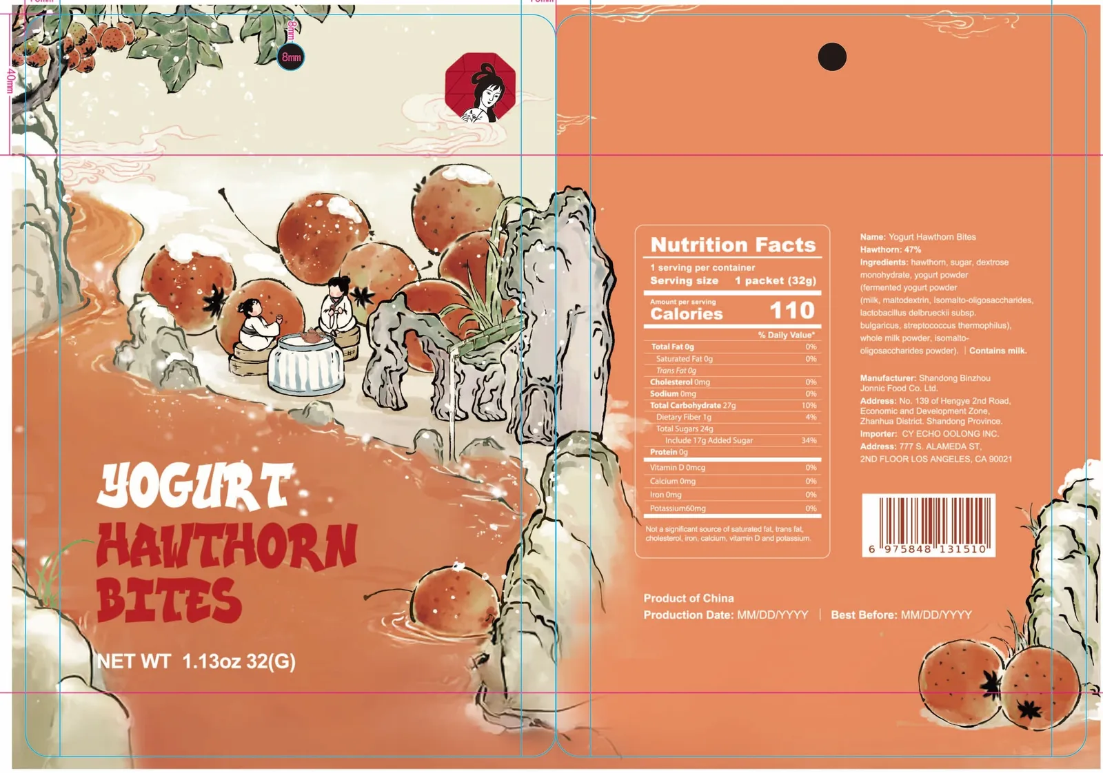
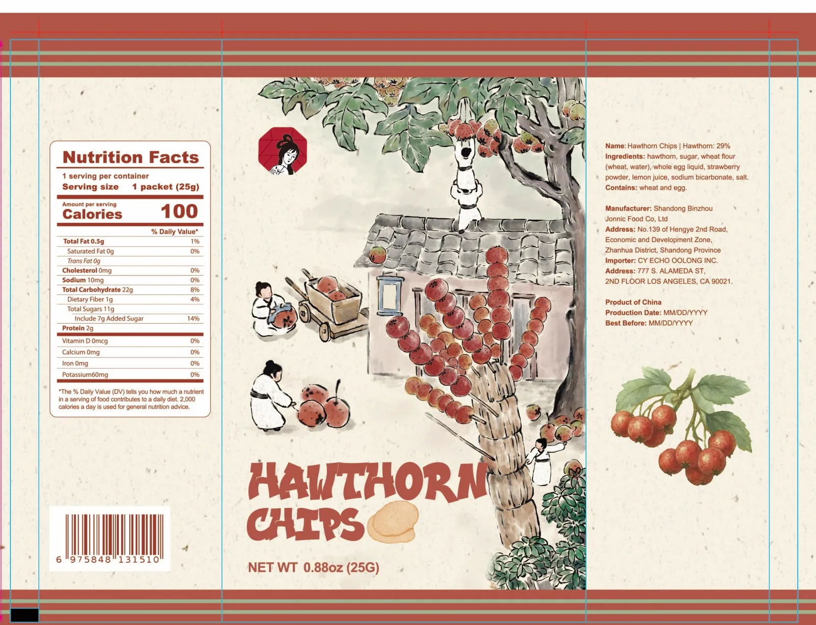
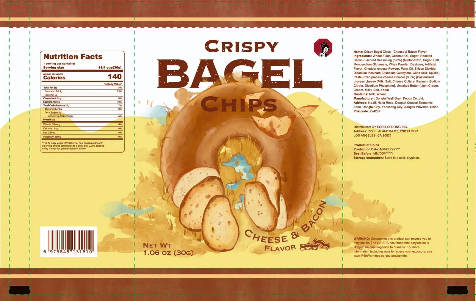
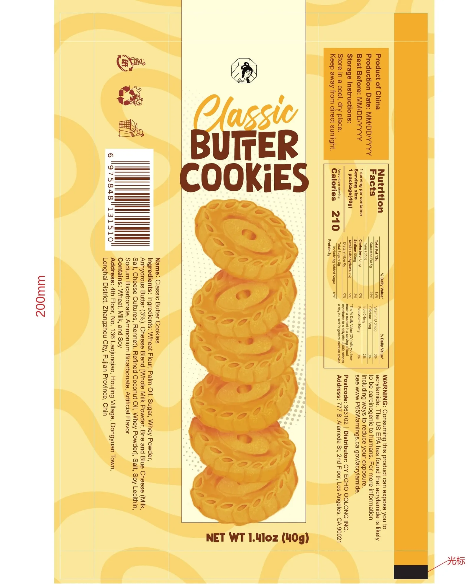
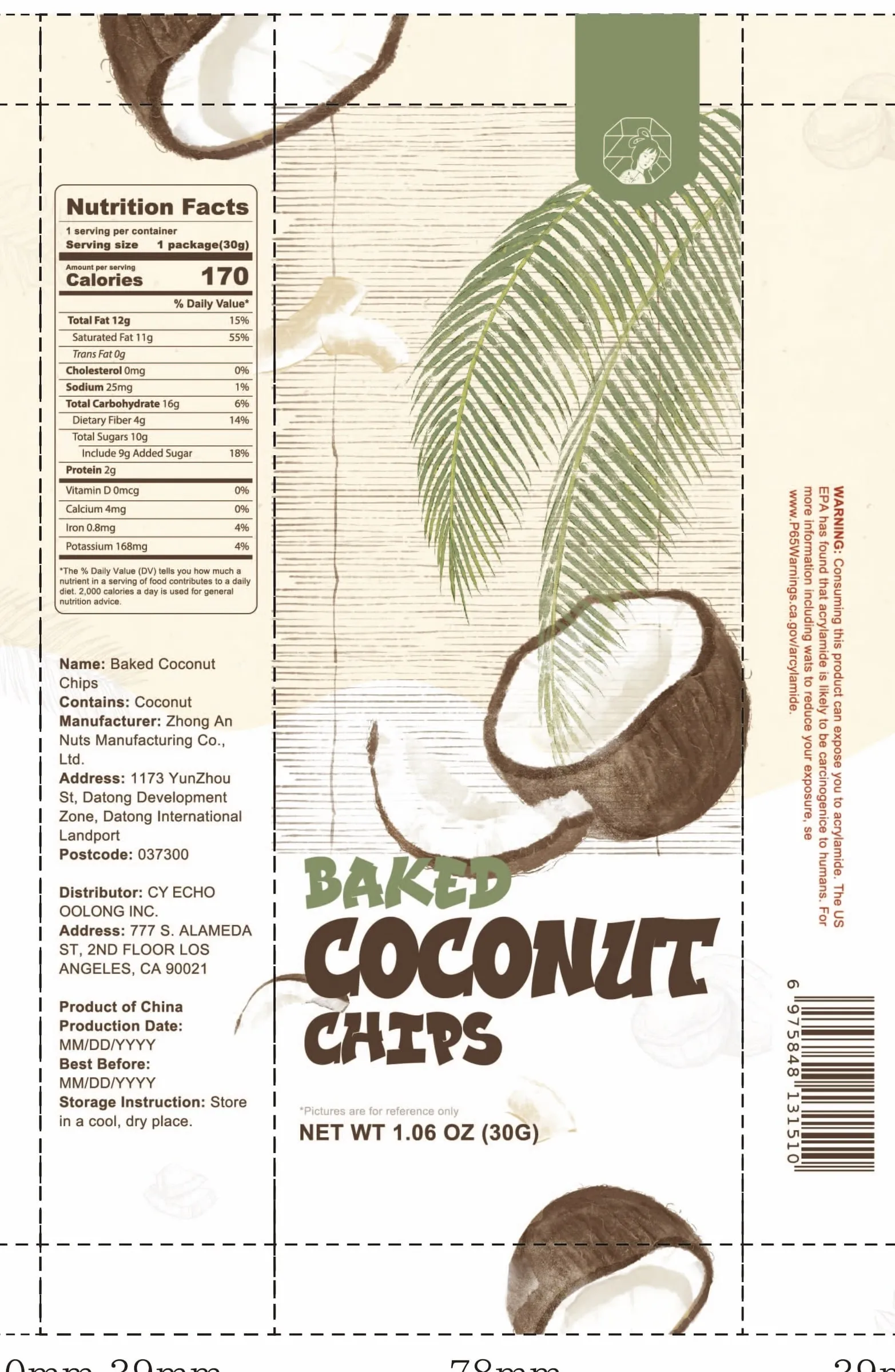
- Twelve packs — crispy pretzel pieces in two versions, cheese sandwich crackers, bagel chips, coconut chips, soda crackers, puffed tortilla chips, roasted pecan pieces, yogurt hawthorn bites, hawthorn chips, brown sugar cinnamon shortbread and classic butter cookies.
- Front of pack — an English name lockup for every product, drawn to sit with the pack's existing illustration and the brand's octagonal badge.
- Back of pack — a Nutrition Facts panel, ingredients, manufacturer and importer blocks, net weight and barcode, arranged to each pack's own proportions.
- Production — every pack handed over as final artwork on its dieline; the film-wrapped packs also mark the unwind direction and keep the photo-eye area clear.
Outcome
- Twelve SKUs delivered as print-ready English artwork for overseas production.
- Scope
- Packaging, Export labelling, Dielines, F&B
- Outcome
- Twelve snack packs rebuilt in English for overseas shelves, each delivered as print-ready artwork on its own dieline.
Completed