Design · Marketing
OVER — product social series
OVER
Context
OVER is a drinkware brand with a growing range of insulated cups, bottles and shakers. Each product drop needs social posts that show the product clearly, explain one or two features, and stay recognisably OVER across the series.
Challenge
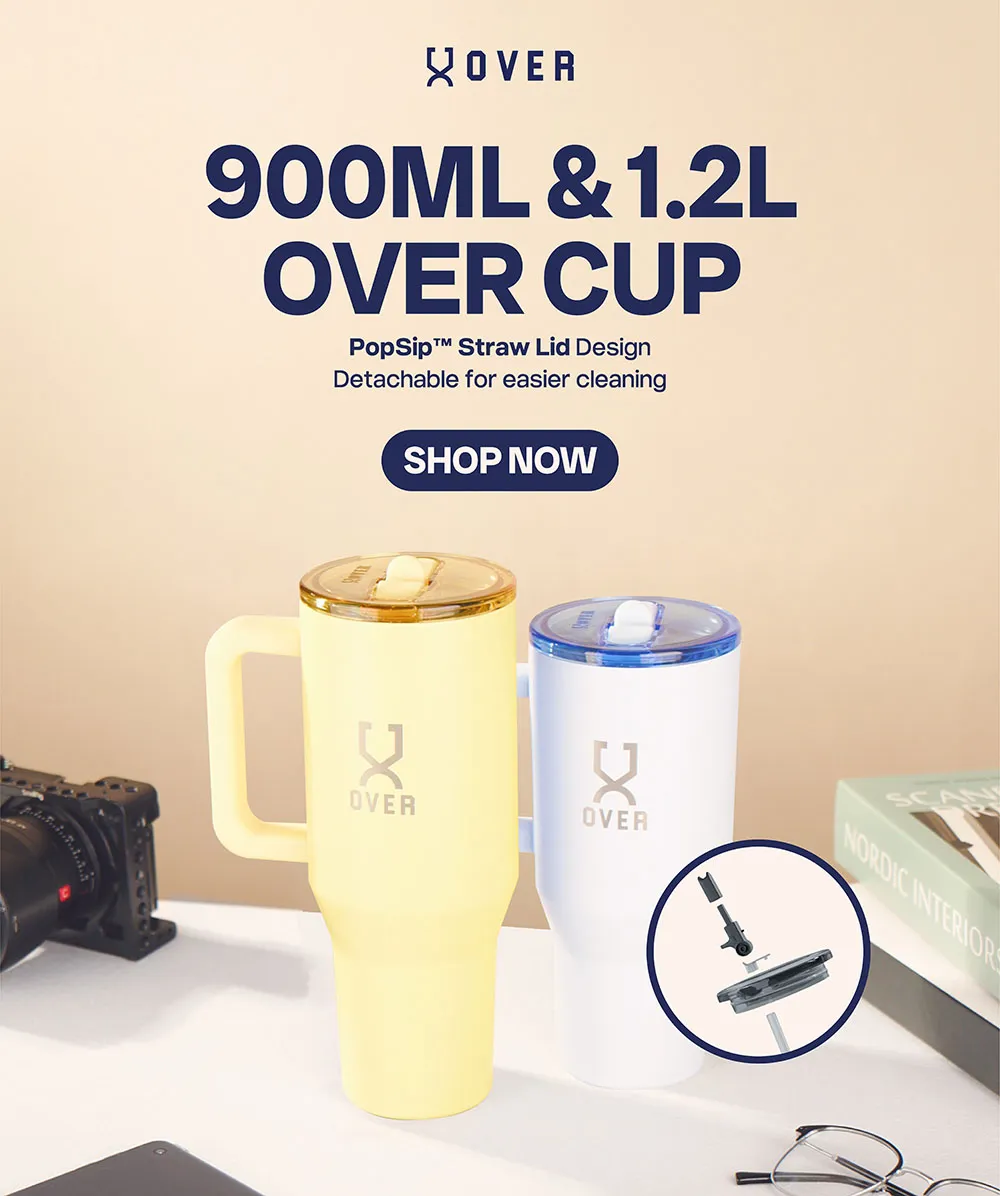
- Keep one visual system across very different products and moods — a warm desk scene, a pastel lifestyle shot, a dark gym set.
- Get feature callouts (capacity, lid type, coating, detachable parts) onto the image without burying the product.
What we did
Design
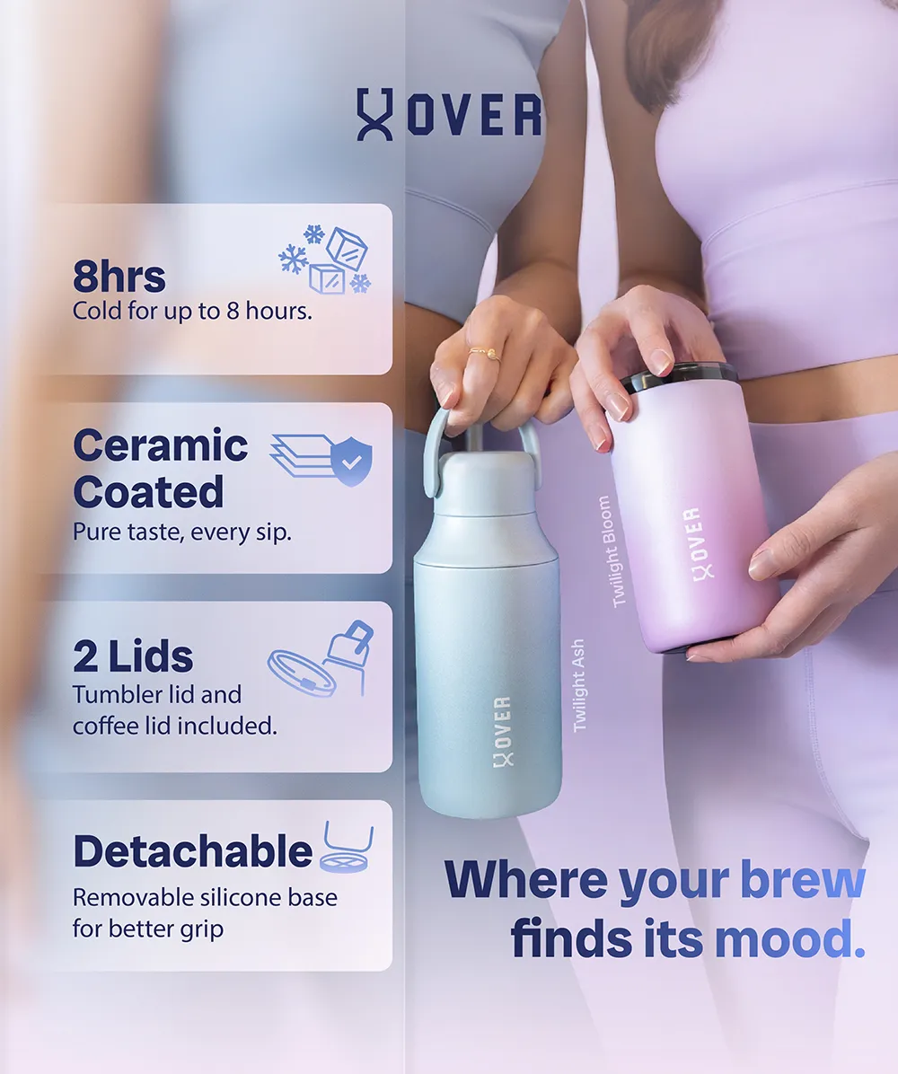
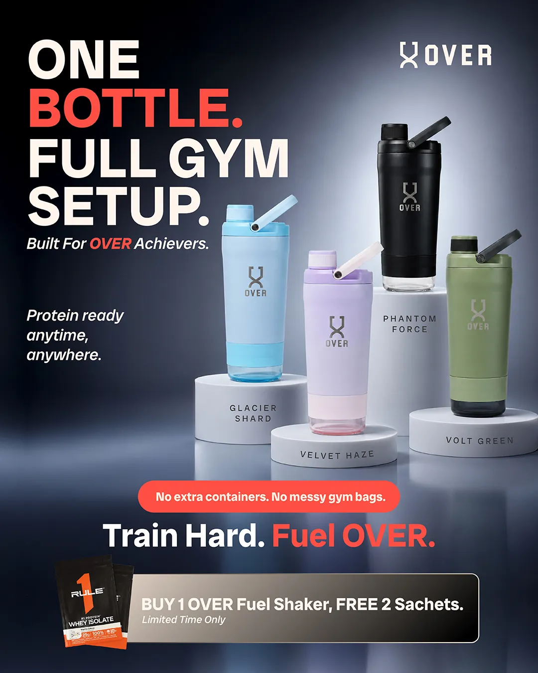
- Product-led layouts — the product always sits centre frame, styled in a scene that matches its use: a work desk for the 900 ml and 1.2 L cups, athletic wear for the ceramic-coated bottles, plinths on a dark set for the gym shaker line.
- Feature callouts — short, bold labels ("8hrs", "Ceramic Coated", "2 Lids", "Detachable") in translucent panels, with a small icon each, so a viewer gets the point in one scroll.
- Series consistency — the OVER mark and a headline-plus-one-liner structure repeat on every post; colour and mood change per product.
Outcome
- Product social posts delivered across the cup, bottle and shaker lines.
- One layout system reused per drop, with new photography each time.
- Scope
- Social content, Product visuals, Drinkware, Series
- Outcome
- A running series of product social posts delivered for OVER's drinkware range — cups, bottles and shakers.
Completed