We design brands that businesses can actually run on — identity, packaging, motion and interface. Then, because we also build, the design survives contact with the real product.
We design brands that businesses can actually run on — identity, packaging, motion and interface. Then, because we also build, the design survives contact with the real product.
For founders launching a brand, marketing teams who need a system their agencies and printers can follow, and product teams who want the interface designed by the people building it. Based in Kuala Lumpur, working across Malaysia and Singapore.
01
From identity to everyday touchpoints
01
Brand identity
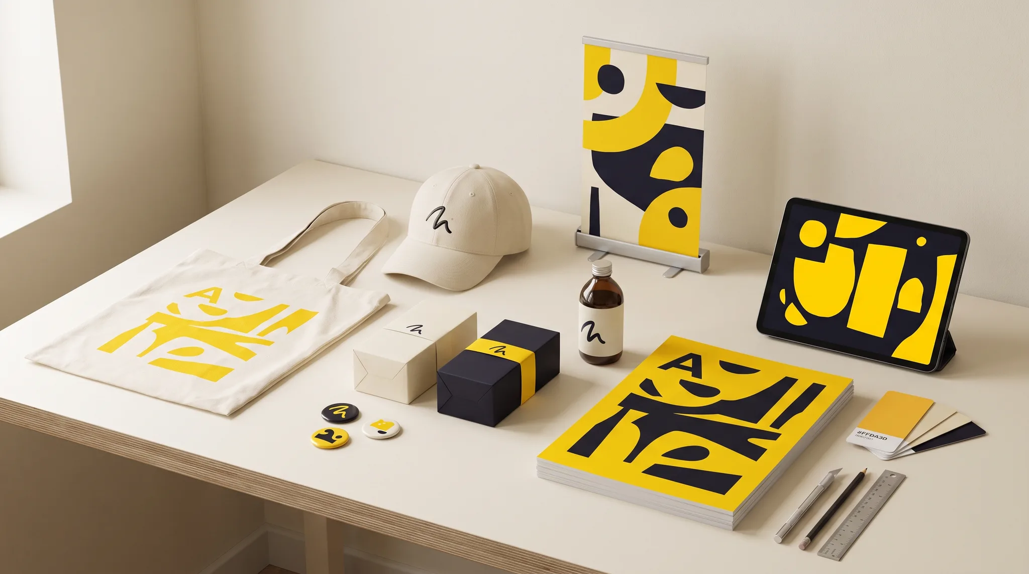
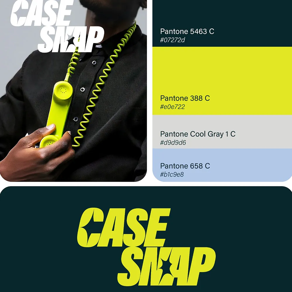
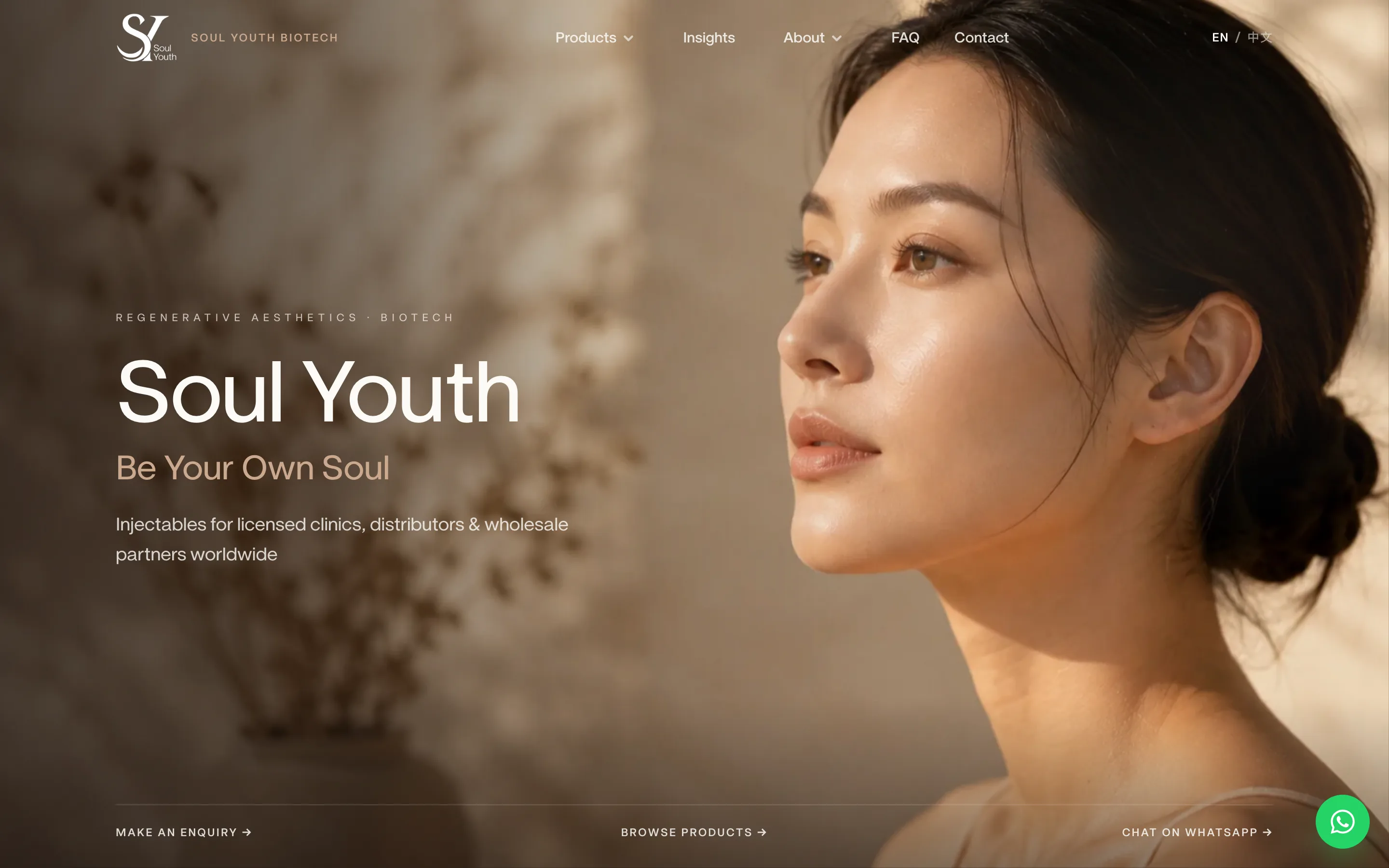
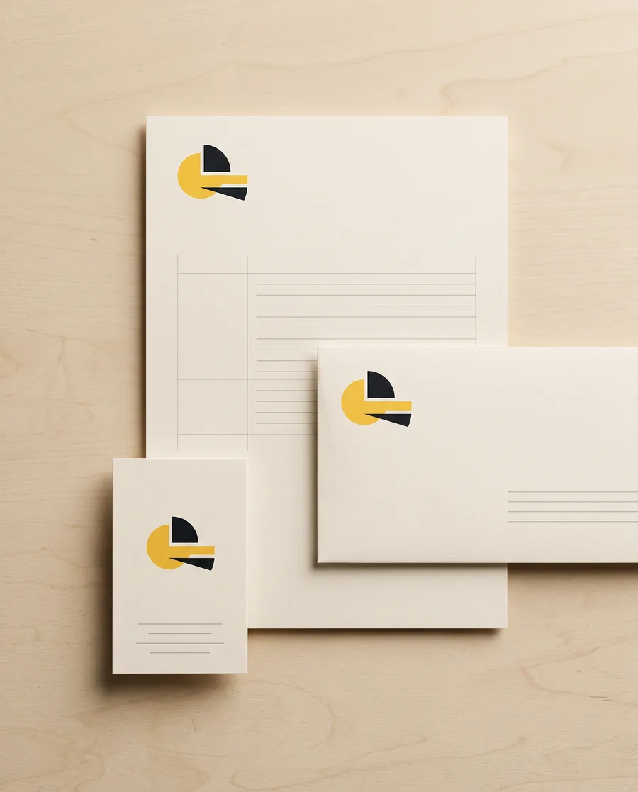
Brand identity is the system a business uses to look like itself everywhere — logo, colour, type and tone of voice, written down so your team and your vendors can apply it without us.
We start with positioning, and the name if it does not exist yet, then build the identity as a set of rules rather than a single logo file: primary and secondary marks, a colour system with contrast checked, a type scale, and the tone the brand writes in. A rebrand begins with what has to stay — customers, equity, signage already in the ground — before we decide what changes. You receive a guideline your printer, developer and social team can all follow.
02
Packaging
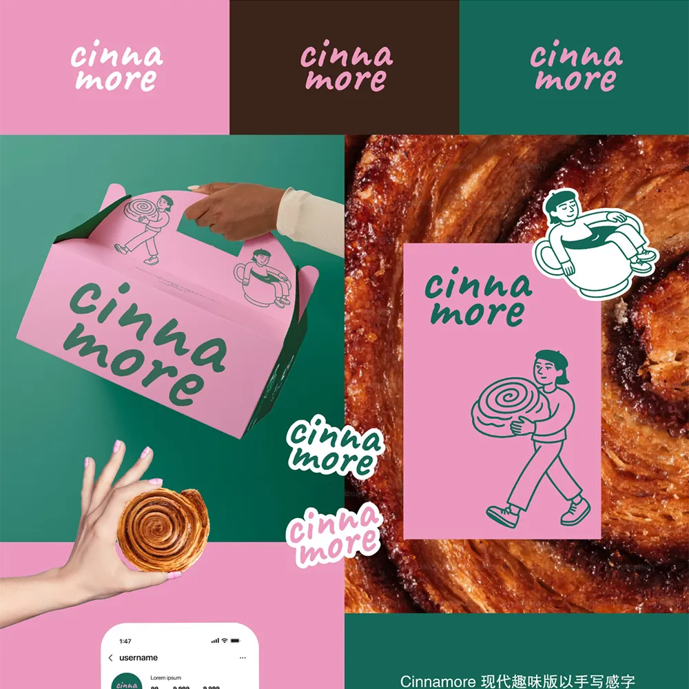
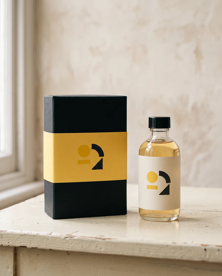
Packaging design covers both the structure and the graphics of the pack, delivered as print-ready files your printer can run without corrections.
Structural and graphic packaging, print-ready.
Structural dielines
Graphic design and artwork
Print-ready files
+How we do it
We work from the dieline outward: material, print method and finishing constraints first, then the artwork, so nothing designed on screen fails on press. Shelf legibility is tested at real size and distance, and the pack is built from the same identity system as everything else, so product and brand read as one. Where a client has no structural supplier yet, we brief and coordinate one.
03
Motion & animation
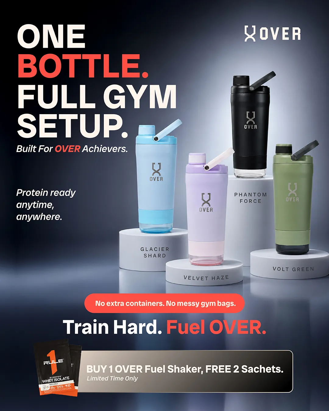
Motion design turns a brand system into moving pieces — brand films, product explainers, animated logos and social loops — that stay recognisably the same brand at 15 seconds or 90.
Brand films, explainers and social-ready loops.
Brand film / explainer
Animated logo and idents
Social loops (9:16, 1:1, 16:9)
+How we do it
Every piece starts from a script and a storyboard you approve before anything is animated. We cut for the place it will play: vertical for TikTok and Reels, square for feeds, widescreen for events and web, with sound designed or licensed for each. Because the motion work uses the same colour, type and marks as the identity, a launch film and a feed loop look like they came from one hand.
04
UI/UX
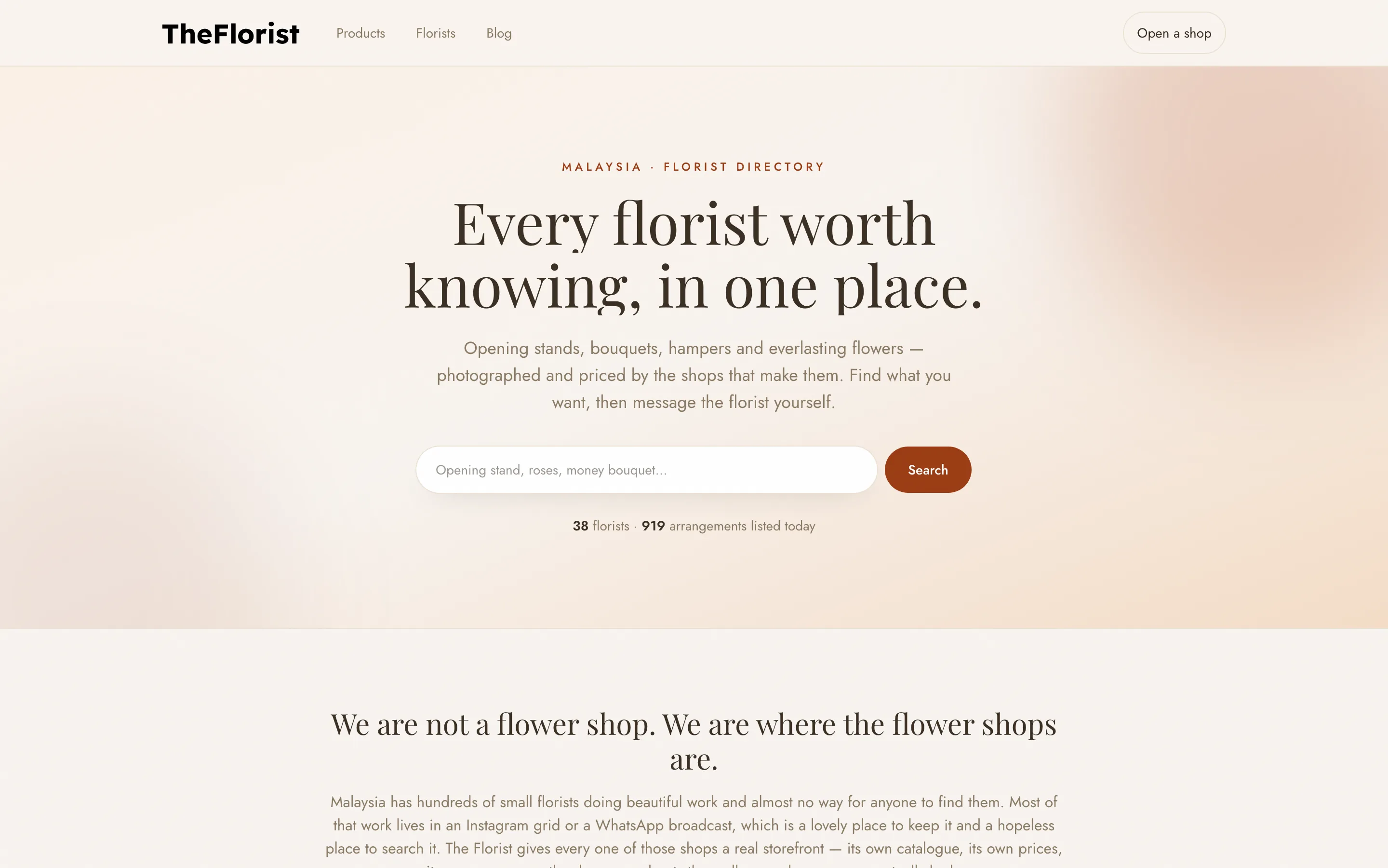
UI/UX design is the interface of your website, app or internal tool, designed by the people who will also build it.
Product and website interfaces, designed with the build in mind.
User flows and wireframes
High-fidelity screens
Component library handed to the build
+How we do it
We map the user flows first, wireframe the screens that matter, then design high-fidelity interfaces and a component library the build uses directly — so what you approve in design is what ships. Designing with the build in mind means decisions about states, empty screens, loading and errors are made early instead of discovered in development. It also means bilingual layouts, accessibility and performance are designed in rather than patched in.
05
Graphic & campaign
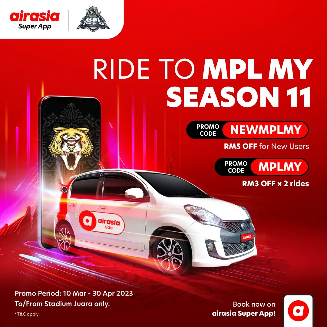
Campaign and graphic design is one key visual and every adaptation it needs — social sizes, in-store, decks and collateral — built as a system so the idea survives each format.
Key visuals, decks and collateral.
Key visual and adaptations
Pitch and sales decks
Print and digital collateral
+How we do it
We fix the idea and its hierarchy first: what the eye reads first, second and third. Then each format is re-cut for its rhythm rather than resized, so a contest mechanics panel, a story crop and a point-of-sale poster all read as the same campaign. The same discipline applies to pitch and sales decks, brochures and event collateral, where consistency across dozens of pages is the whole job.
02
How a brand gets made
01
Discover
One call, one brief. We find out what the business actually needs before anything is designed — who buys, where the brand has to live, what already exists and has to stay. You get the brief back in writing to confirm.
02
Directions
Two to three real routes — not mood boards — so you choose between finished ideas. Each route is shown on the touchpoints that matter for you: a pack, a screen, a post, a sign.
03
Refine
We develop the chosen route across every touchpoint until it holds up. Colour is contrast-checked, type is tested at small sizes, and the system is stressed against the awkward cases before it is called done.
04
Deliver
Source files plus guidelines, in the formats your printer, developer and team need: vector marks, colour and type specs, exported assets for web, print and social, and a walkthrough of the guideline with your team.
03
Design that survives the build
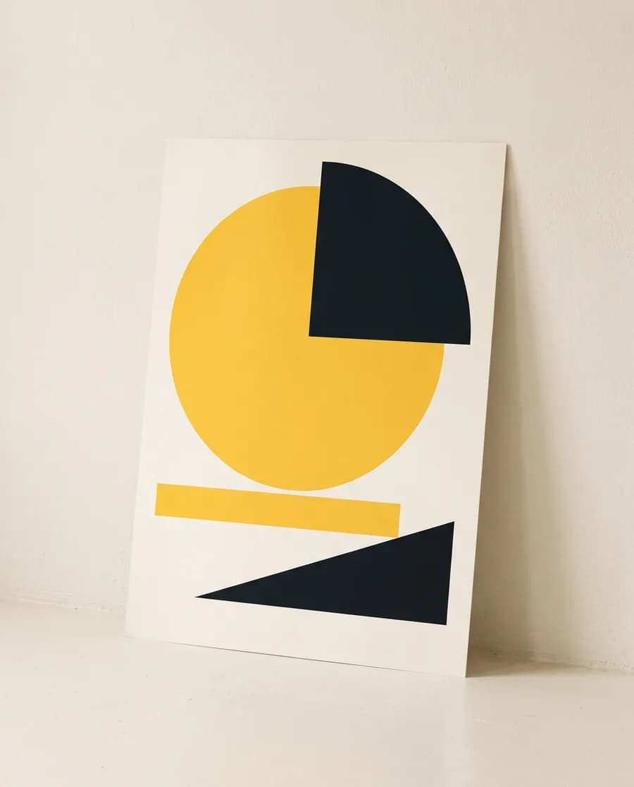
Most design is handed to a separate developer, a printer or a social team, and loses something at every hand-off. At Laboe the people who design your identity also build your website and run your campaigns, so the system we draw is the system that ships. The demonstration below is how we think about it: one wordmark, one palette, one type scale and one grid, recomposed across identity, packaging, campaign, screen and feed without changing.
A focused identity — logo, colour, type and a short guideline — usually runs four to six weeks from brief to files. Packaging, motion or a full guideline add time on top. We confirm a schedule at the brief stage.
Do you do rebrands?+
Yes. A rebrand starts with what has to stay — customers, equity, signage already in the ground — and what has to change. We plan the rollout across every touchpoint, not just the logo file.
Can you design and also build the website?+
Yes, and that is the point. The same team designs the interface and builds it, so nothing gets lost between a design agency and a separate developer.
What do we receive at the end?+
Source files (vector logos, type and colour specs, artwork), exported assets for web, print and social, and a guideline document your team and vendors can follow. For UI work, a component library the build uses directly.
Do you work with startups?+
Yes. For early-stage companies we scope a smaller first release — a usable identity and the assets you need to launch — and grow it as the business grows.
Refresh or full rebrand — how do we decide?+
We audit what the current brand still earns — recognition, trust, assets already in the market — against what is holding the business back. If the mark works but the system around it is inconsistent, a refresh fixes the system and keeps the equity. If the positioning has moved, we rebrand and plan the rollout so nothing goes dark in between.
Do you work with our printer and suppliers?+
Yes. We brief printers, packaging suppliers and signage vendors directly, supply files in the format they ask for, and check proofs before anything runs. If you do not have a supplier yet, we can recommend one.